Perhaps, one of the most important issues that interest us after the repair is a choice of colors that can convey our mood and preferences.
Choosing a color palette for interior designers is always a very important process. Here we take into account the age, gender, culture and interests of the household. Harmoniously matched colors have a beneficial effect on the well-being and general mood of a person, so in their choice you need to follow some rules of the combination, which we'll talk about today.
Choose a palette of colors for the interior
Since, first of all, the background in the room is created by walls, their decoration should be given special attention.
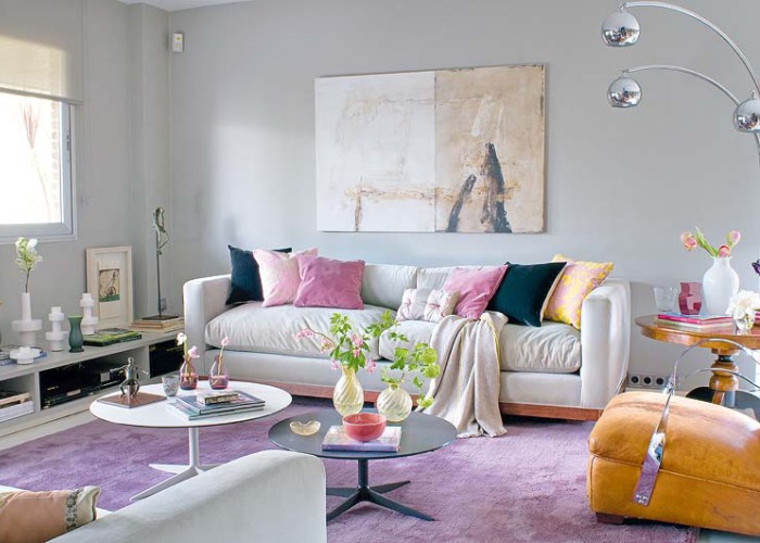
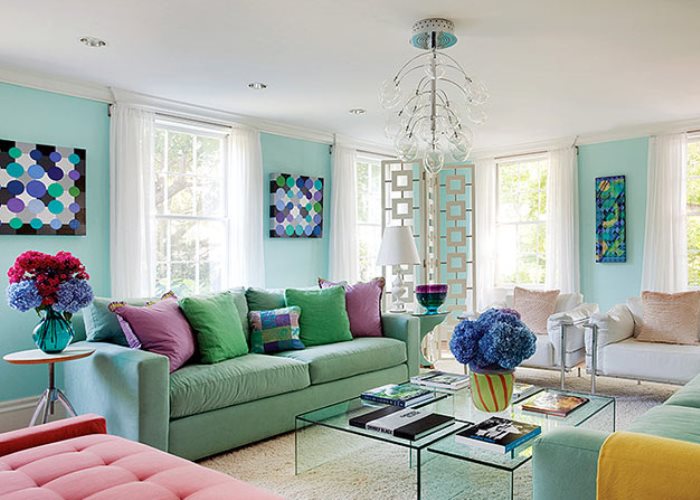
The color palette of wallpaper in the interior of the living room with furniture and curtains of blue , gray, brown, dark green shades includes lemon, olive, beige, golden, cream, milky, lilac, heather or peach tones. If on the contrary, it is necessary to muffle a large amount of light or to emphasize light furniture, carpet, saturated lime, blue, red, brown, purple, yellow, orange, lilac and blue colors are appropriate.
| | | |
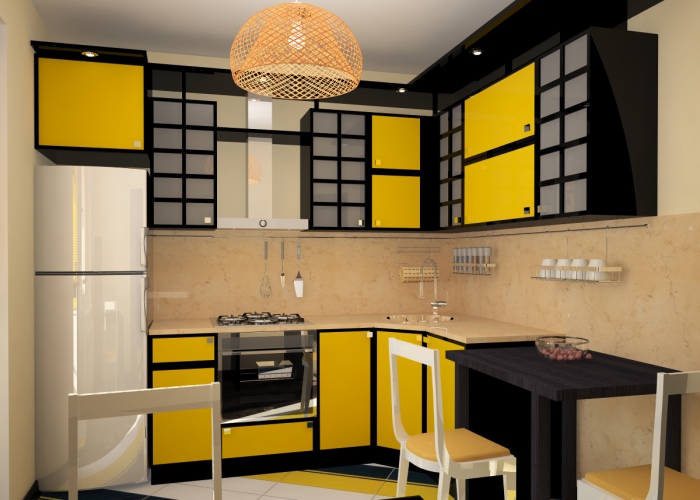
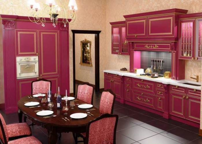
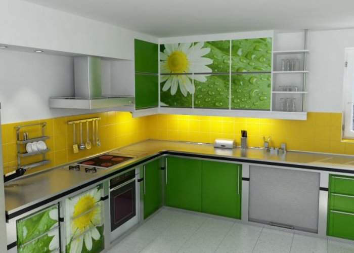
The color palette in the interior of the kitchen is usually made up of "tasty", often even fruity summer colors that are disposed to food intake and do not irritate. It can be the color of lime, pistachio, green apple, rose, peach, coral, lime, egg yolk, perfectly combined with dark furniture and the same kitchen apron.
| | | |
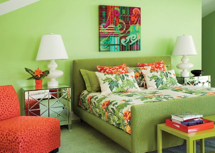
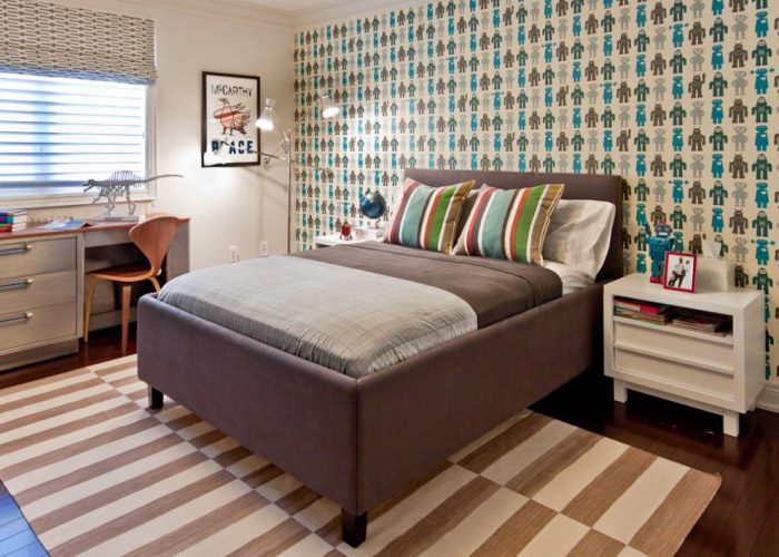
Selecting the color palette of wallpaper for the interior of the bedroom, pay attention to warm, muted tones of brown, turquoise, pink, light green or pastel colors. If the bed linen is light, the wall at the headboard can be made dark brown, bright red, green, orange or crimson, so it will not catch your eye and at the same time diversify the interior.
| | | |