The meaning of color for today is spoken and written by so many. What we contemplate has an influence on our psychological and emotional mood. Proceeding from this, color combinations in the interior are of great importance and this issue needs to be given due attention. The color design of the room can lead a person into depression or vice versa - adjust to a positive and calm the nervous system.
Color palette value
To correctly choose the color combination, you need to consider the meaning of each color individually. Scientists devoted much time to this issue and came to the conclusion that among a huge number of color shades one can distinguish cold and warm tones. Warm colors are considered as yellow, red, orange . Cold - green, blue, blue, purple. White , black and gray are considered neutral shades. The harmony of color combinations in the interior directly depends on the correct interaction and complementation of the color palette. Each color carries a certain urge and mood. Some are designed to cheer up, intensify attention, others - to relieve stress, relax.
The combination of colors in the interior
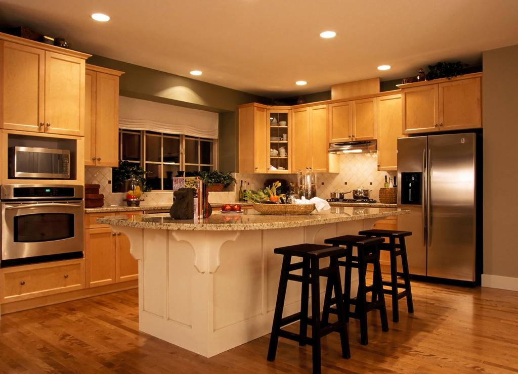
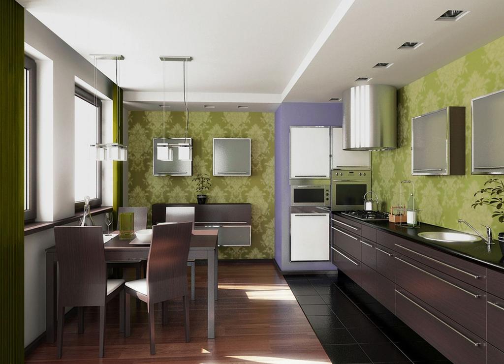
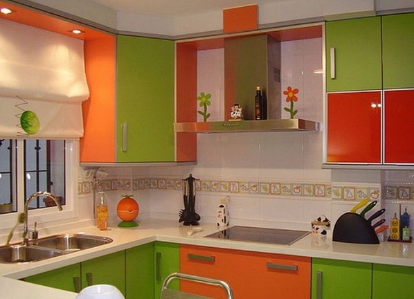
The choice of the color palette depends directly on the room in which it will be used and, of course, on the design. Color combination in the interior of the kitchen provides for the use of different colors and shades. To date, an abundance of design solutions in the design of such an important room is shocked by the presence of varieties in color ratio. Any kitchen can be the embodiment of your ideas and desires. What matters is what you expect to see in the final version: strict and classical, cozy and domestic, bright and extraordinary, positive and hospitable, elegant and aristocratic. Take into account your wishes, so that the choice of color palette helped display all the ideas conceived. Do not forget that with the help of light colors you can expand and visually increase the space, and dark colors will help to bring a certain emphasis. Bright and catchy shades visually reduce the space and can be used only in small details.
| | | |
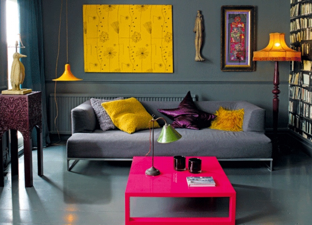
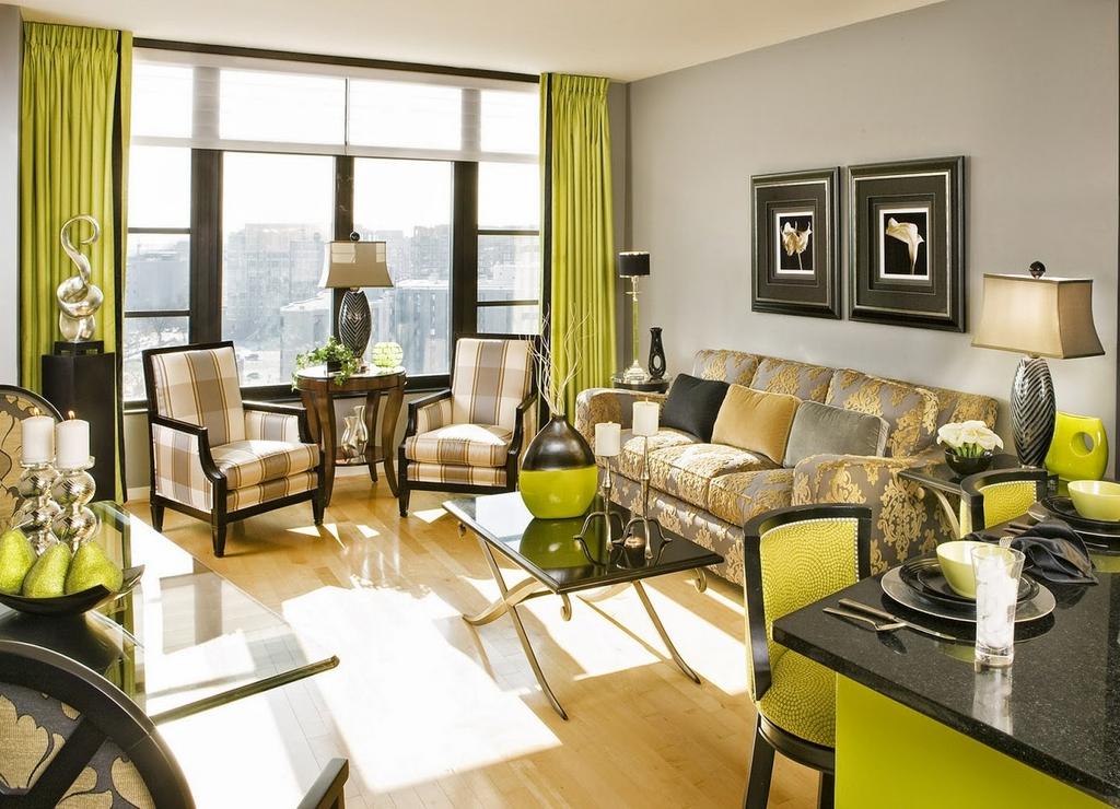
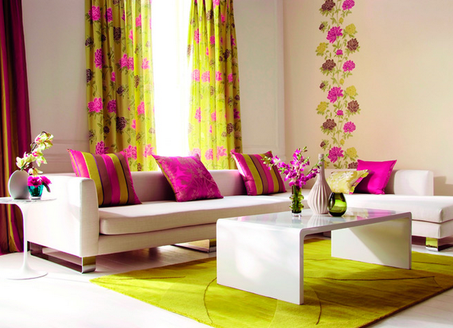
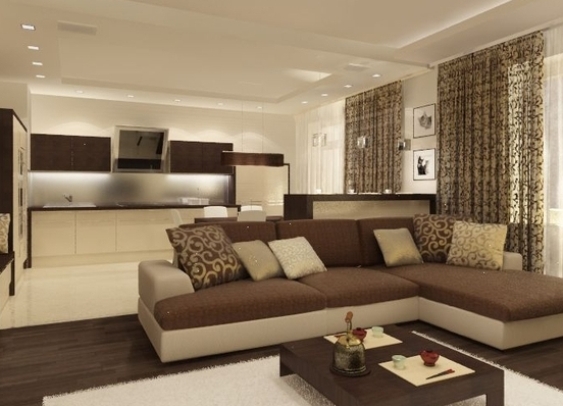
It is necessary to correctly use color combinations in the interior of the living room, so as not to turn one of the important parts of the living quarters into a boring, monotonous room. You must select one or two primary colors that will be basic. The following color blotches will be just a complement and small accents. The choice will depend directly on the size of the living room and your idea of it. It can be a restrained style or bold and catchy. Combine the color design with furniture. It can be absolutely contrasting shades. In the presence of dark walls, you can use light shades of furniture. This will give a special effect to the room.
| | | |
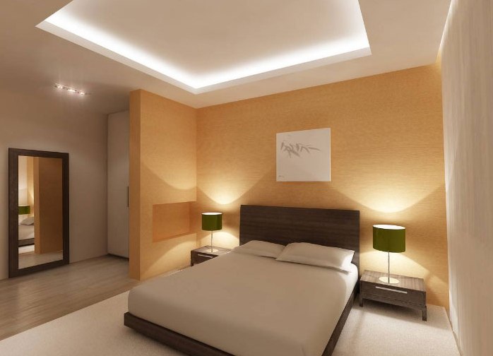
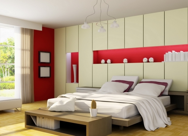
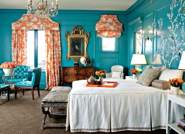
Color combinations in the interior of the bedroom can be divided into several types: contrast, monochrome, mixed. The bedroom with contrasting shades looks very bright, bright and elegant. It is worth noting that not everyone can afford this option, because often the bedroom is perceived as a quiet, peaceful place for rest and sleep. A single-color combination creates a calm atmosphere, disposes to sleep, gives a feeling of lightness and weightlessness. With a mixed version, the base is light shades. The accent is created due to the interspersing of bright and catchy tones.
| | | |
Do not forget that the color design should first of all deliver aesthetic pleasure and enjoyment to the owner of the apartment.