The living room is undoubtedly the face of your house, and it is necessary to decorate it very scrupulously and correctly. A huge role here is played by the color gamut that you want to use. After all, the atmosphere that reigns in this room will depend on it. Wrong color combinations in the interior of the living room can act depressingly on the psyche, irritate the owners, which will lead to a new quick repair. After all, you just can not stay in such an uncomfortable situation for a long time, and try to change the screaming or gloomy interior to something more acceptable.
The right combination of colors in the design of the living room
Interesting monochrome interior
In this case, we are dealing with a rather unusual and even slightly paradoxical variety of design. It is absolutely not necessary to be afraid that your interior will turn into something monochrome and dull. The picture will be at least two-color, and more often in the presence of other small impregnations. The main color performs the same role as the main theme in the musical work. He creates an inner atmosphere, and adjusts his own way.
If the children's room monochrome landscape is not very suitable, the children like the riot of colors and variety, then for the living room it will seem like an excellent option. Restrained style will talk about the good taste of the owners. The combination of wallpaper colors in the living room is important in a monochrome interior. Light walls will increase your space, so this technique can be safely used to visually adjust the volume of the room.
If you want to diversify the black and white picture, then use gray or beige color. Lovers of modern design should pay attention to chrome and gold plated items or accessories. Also, you should not neglect one good rule: if you chose dark walls, then buy light furniture or act completely the other way around. This contrast will make the monochrome living room the most effective room in the apartment or house.
| | | |
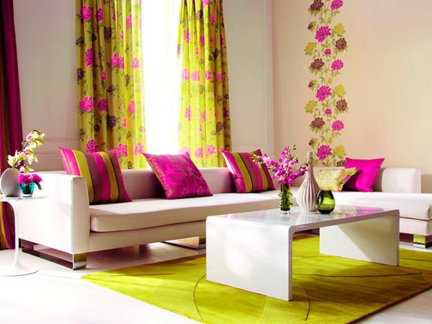
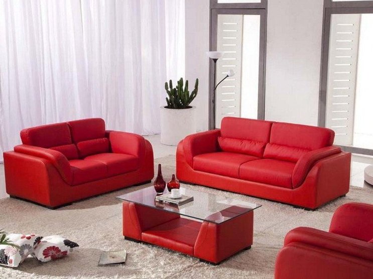
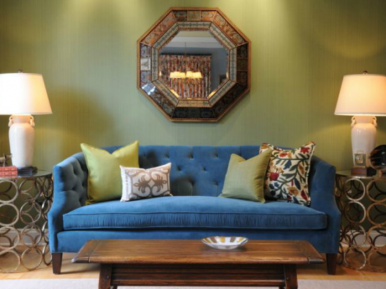
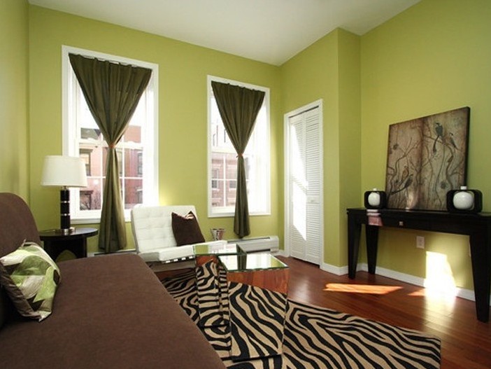
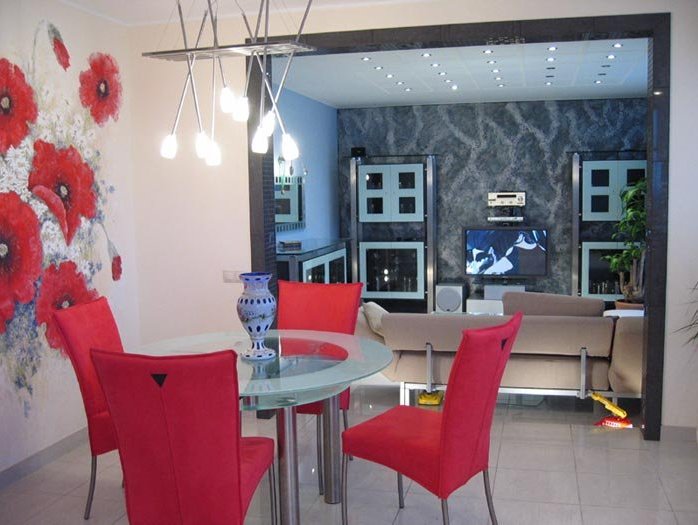
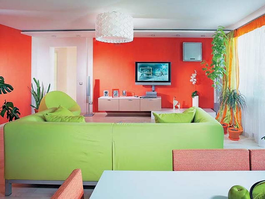
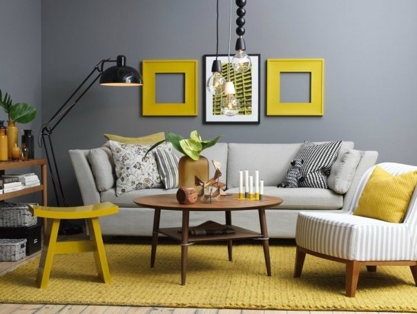
Spectacular contrasting interior
The combination of bright colors in the interior of the living room can not be found very often. Usually owners buy wallpaper or furniture of pastel and restrained shades. Many are afraid that such colors will irritate the eyes. But creative individuals who love experiments, depart from bored stereotypes. Consider the most common variants of contrasting interior:
- bright (red, burgundy, orange) furniture against a background of plain white or salad walls;
- The saturated green color is well adjoined to brown;
- raspberry patches on a background of yellow background;
- pistachio color next to cheerful golden;
- blue or lilac furniture on the background of emerald wallpaper;
- orange objects in the pastel interior.
| | | |
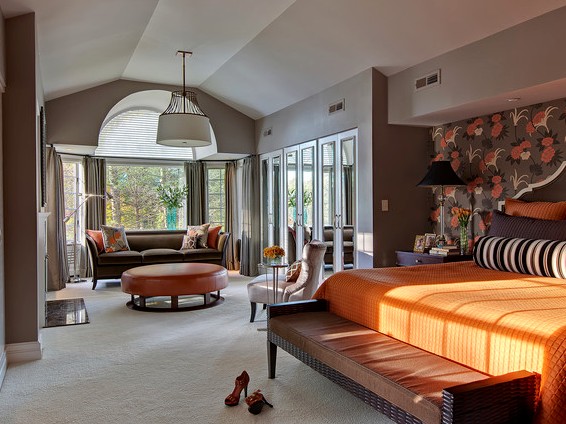
Living room combined with another room
It is clear that here one basic color is indispensable. You will have to separate the sleeping area or the dining room from the space where you receive guests. In this place, you can paint walls in a more cheerful and light colors, but the rest area requires a slightly different approach. It is better to make it more calm and peaceful. Accordingly, color for painting walls or wall-papers select a calm, tuning for a dream and rest.
| | | |
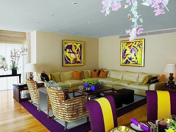
What is complimentary color ?
Very well helps to understand the issue of combining the colors of the circle of Itten, broken into special sectors. On it you will see the opposite colors-antipodes (complementary), the combination of which instantly attracts the eye. The use of such a combination in the upholstery of furniture or textiles located in the living room, looks extremely effective. In its purest form, this combination looks somewhat aggressive, and therefore it is necessary to dilute this pair with neutral shades.
| | | |
It must be remembered that you create comfort for yourself, and you need to listen first of all to your inner voice, and then take into account the fashion trends and advice of the designer. Imagine how your room will look from the outside, how much the interior is full, it may be better to make some corrections by changing the color scheme. Only in this way will you create a cozy living room that will delight your eyes.